


GO-The Super App
Go is an all-in-one app that simplifies your life. It lets you shop for clothes and groceries effortlessly, while enjoying uninterrupted streaming of movies and shows. It's like having a personal assistant on your phone.
Role
UX/UI Designer
Team
Individual
Tools
Figma, FigJam, Whimsical, OptimalWorkshop, Canva, and UsabilityHub
What I did
User Interviews, User Persona, Information Architecture, Storyboarding, Wireframing, Visual Designing, Prototyping, and Usability Testing
Timeline
June 26, 2023 - July 07, 2023 (80 HRs = 2 weeks)
Background
In recent years, the rapid advancement of technology and the widespread use of smartphones have significantly altered our interactions, communication, and access to services. People have become accustomed to utilizing various applications for ride-hailing, food delivery, banking, and more, resulting in a fragmented user experience with multiple apps, logins, and interfaces. This inefficiency adds to cognitive load and diminishes the overall user experience.
To tackle this challenge, the concept of an end-to-end super app has emerged. The primary goal is to consolidate a wide range of services and features into a single, unified platform, enabling users to seamlessly access multiple services without the need to switch between different applications. Companies like WeChat and Grab have successfully popularized this idea by integrating messaging, payments, ride-hailing, and other services within their platforms. As a result, other businesses have been encouraged to develop their own super apps, offering users a convenient one-stop solution, streamlining digital interactions, and improving the overall user experience.
For businesses, super apps present exciting opportunities. By leveraging an existing user base and integrating multiple functionalities, companies can extend their reach, offer personalized experiences, engage customers, and increase their revenue streams. The rise of end-to-end super apps signifies a significant shift towards a more integrated and user-centric digital experience, fundamentally transforming how we access and interact with digital services. As technology continues to advance, these super apps are set to revolutionize the digital landscape even further.
What is GO?
The "Go" app allows users to access and use various services simultaneously without the need to switch between multiple applications. This streamlines tasks and enhances multitasking.
With the "Go" app, users can save storage space on their devices because they don't need to download multiple individual apps. This reduces app clutter and simplifies app management.
Consolidating services into the "Go" app eliminates the requirement to log into multiple apps. Users can conveniently access various functionalities without managing multiple login credentials, saving time and effort.
By using a single app, the "Go" app, users reduce security risks associated with multiple apps and login credentials. This provides a more secure and protected digital experience.
The "Go" app offers a seamless user experience, enabling efficient access to a variety of services within one platform. This enhances user convenience and satisfaction.


Solution
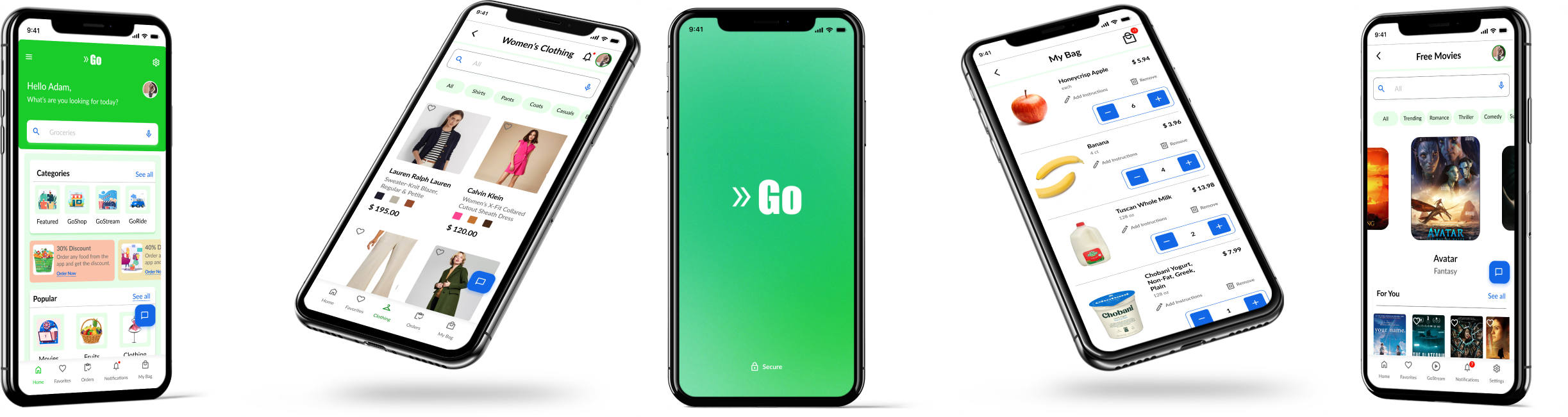
"Go," the all-in-one super app, offers users a convenient way to shop for clothing items, groceries, and more. It also keeps users updated with the latest movies and shows. With Go, users can stream their favorite content in one place, eliminating the need to switch between multiple applications for different tasks.
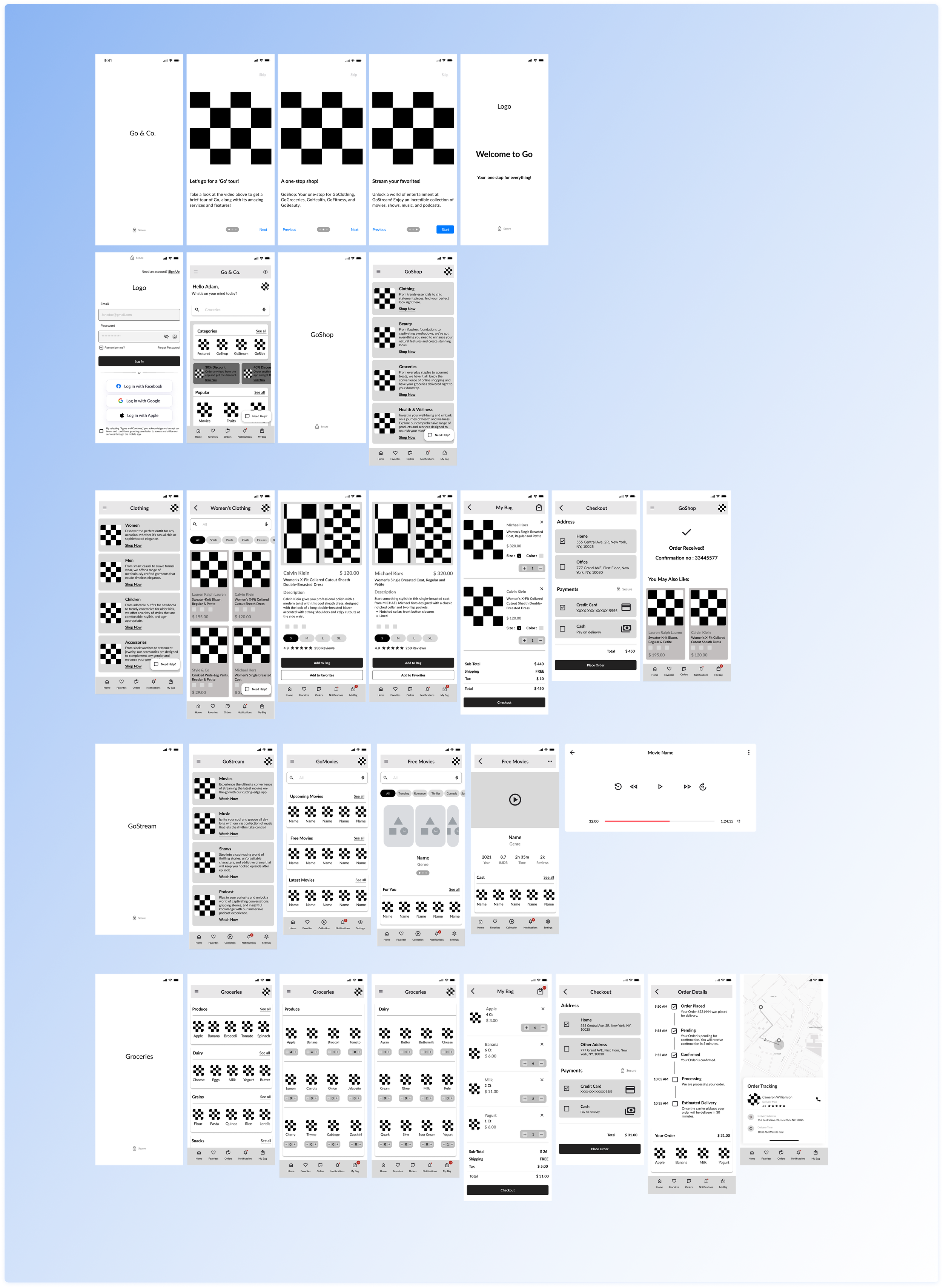
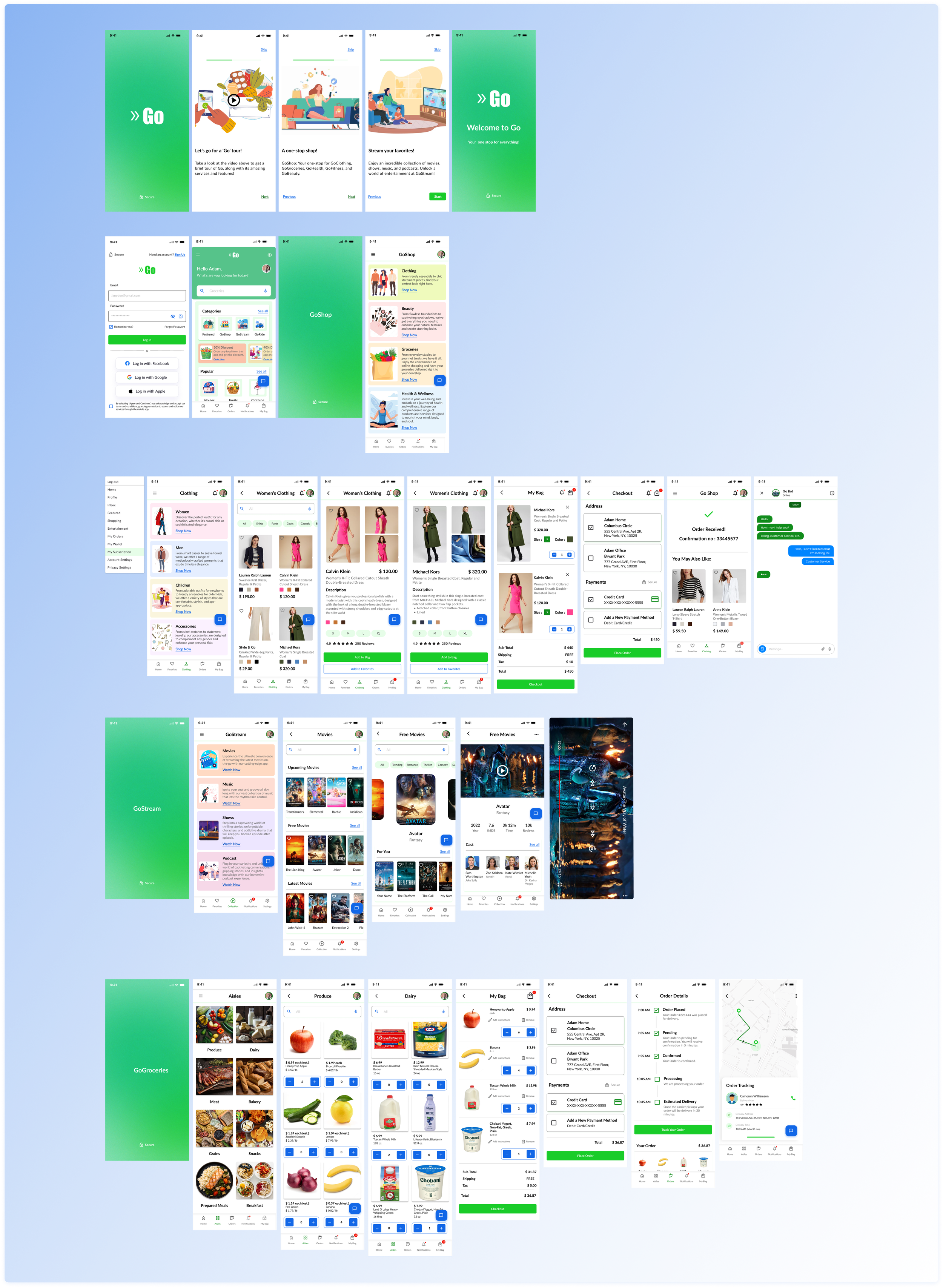
“Go” Onboarding & Dashboard
Users get a preview of all the services provided by Go.
Access to a dashboard with multiple services and the latest offers is available to users.
GoShop
GoShop provides users with various options to shop for favorite brands, groceries, and grooming items.
Users can access the "GoShop" platform to conveniently browse and purchase items from the clothing section.
GoGroceries
At "GoShop," users can select the "Groceries" option.
Users can easily place an order for their required items.
After placing the order, users have the ability to track its status.
GoStream
The dashboard allows users to access "GoStream."
Through "GoStream," users can enjoy their preferred movies and shows.
Users can view the list of available movies and play their favorites with ease.
How have I achieved these results?
Understanding the Problem Space
To better understand our users' needs, I crafted an innovative research plan encompassing user interviews, surveys, and competitive analysis. This comprehensive approach enabled us to gather valuable insights and uncover vital information about our target audience. Using this knowledge, I meticulously developed user personas that serve as guiding beacons, illuminating the path toward enhancing our product's usability.
Research Goals
The research aimed to achieve the following goals:
Assess user perceptions and preferences regarding the concept of an end-to-end super app, including expectations, needs, and challenges in managing multiple applications.
Analyze existing end-to-end super apps in the market, evaluating strengths, weaknesses, and user feedback to identify key success factors and limitations.
Examine the technological requirements and infrastructure necessary for developing and maintaining an end-to-end super app, considering scalability, security, data integration, and interoperability.
Evaluate market potential and business opportunities for developing and deploying an end-to-end super app, including market demand, competitive landscape, and potential monetization models.
Empathize
Research Methodologies
User Interview Insights
Survey
Competitive Analysis
Affinity Mapping
Personas
Research Methodologies
Every research approach acted as a building block, propelling me forward and contributing to my advancement. I initiated the process with User Interviews, subsequently delved into User Surveys, performed Competitive Analysis, and finally conducted a secondary analysis.
User Interviews
To gather insights and perspectives on the topic of investigation, I conducted interviews with a diverse range of 4-5 individuals. User Interviews included contacts from my network and members from relevant Discord communities. The aim was to obtain a comprehensive understanding of their experiences and opinions. I sought to capture a broader range of insights, by engaging participants from different backgrounds.

“The super app will save time and avoid the need to download multiple apps. It is also cost-effective because it eliminates the necessity of installing and maintaining multiple applications.”
- Abdullah’18

“If you're a New Yorker, the super app will revolutionize how you live. Eliminating the hassle of switching between multiple apps, simplifies your life. This not only saves you time but also provides greater convenience. Given the fast-paced nature of life in New York, having this efficient and convenient super app readily available will truly give you an edge.”
- Asma’28

“I appreciate apps with a simple and uncluttered design, focusing only on essential features. For example, I find Instagram overwhelming due to its numerous features, some of which I don't find useful. On the other hand, I like Whatsapp’s user-centered and user-friendly interface. It's easy to navigate and provides a seamless user experience.”
- Niti’30
“The apps with text smushed together, with no spacing between buttons, can be overwhelming.”
- Kaneez’15
“Due to a personal experience where my father's Uber account was hacked, I have trust issues with the platform. Ensuring security is my primary concern whenever I use any app.”
- Annabell’24
Survey
To collect a diverse range of quantitative data, surveys were utilized. The survey link was distributed through Discord to a minimum of 10-12 individuals including friends and family, to gather responses. Optimal Workshop was employed as the survey platform to collect data and generate a comprehensive dataset effectively.

Competitive Analysis
I conducted a thorough competitive analysis to gain valuable market insights and evaluate competitor offerings. The focus was on examining the design of their interfaces and the features they offer. Additionally, I conducted secondary research to understand the super app market in the US.
The competitive analysis reveals that super apps have a stronger presence in Asian markets than European or Western markets, which may be attributed to cultural differences, the historical development of the technology industry, and consumer preferences. The following detailed analysis showcases the dominance of various apps in Asian markets.
Presented here is data indicating the rise of super apps in Asian markets and their significant impact.

-
![]()
We Chat (China)
With 1.2 billion monthly active users, diverse integrated services, and full support from parent company Tencent for gaming, entertainment, and financial services, it boasts a massive user base, seamless user experience, and a robust ecosystem.
-
![]()
Alipay (China)
With a staggering user base of over 1 billion, deep integration within the Alibaba ecosystem granting access to e-commerce, entertainment, and beyond, and a strong foothold in both online and offline payment systems, it boasts an extensive reach and versatile presence.
-
![]()
Grab (SE Asia)
As a leading force in the Southeast Asian market, it has amassed over 200 million app downloads, offering extensive services such as ride-hailing, food and grocery delivery, and financial services, while forging robust alliances with local businesses and enjoying government backing.
-
![]()
Gojek (Indonesia)
With over 200 million app downloads, it is commanding position in the Southeast Asian market, providing diverse services like ride-hailing, food and grocery delivery, and financial services, and enjoying strong collaborations with local businesses and government support.
-
![]()
Paytm (India)
With a massive 450 million registered users, it is the foremost player in the Indian market. It offers a wide range of financial services encompassing payments, banking, lending, and wealth management, while forging strategic alliances with multiple Indian businesses and actively participating in government initiatives.


Secondary Analysis
In the article "Are Super-Apps Coming to the U.S. Market?" by Dan Prud'homme, Guoli Chen, and Tony W. Tong, it is explained that super apps are mostly popular in Asian markets because of cultural differences, historical tech industry development, and consumer preferences. However, the US market has a fragmented app market due to the initial focus on web services and concerns about organization, finance, and ad revenue loss. Nevertheless, US consumers, including both young and old, have a growing interest in integrated platforms like super apps. App overload and accessibility issues have made consolidated super apps appealing as they provide a comprehensive user experience. Technological advancements in AI, blockchain, and VR present opportunities for developing complementary tools and new types of super-app-like ecosystems. Although the US market may not replicate the models seen in Asia, regulatory pressures, changing demographics, app overload, and technological advancements motivate American tech companies to create their own versions of super apps. In summary, while super apps are more popular in Asia, there is an increasing interest in similar integrated ecosystems in the US driven by consumer demand and evolving tech companies. The demand for super-ish apps in the US is influenced by younger and older Americans, app overload, and technological advancements.
Affinity Mapping
Users welcome new technology and prefer a user-friendly app design with a clean interface and easy navigation while appreciating accessibility options like voice commands and valuing video tutorials. They prioritize security and privacy, enjoy shopping, entertainment, and chatting features in a Super app, and expect a seamless experience without technical issues.

Defining the Problem
The crowded app market poses security risks as users log in to multiple accounts and share personal information, making them more susceptible to vulnerabilities and, consuming substantial storage space on phones. To address these issues, the emergence of a super app provides a solution by reducing storage load, improving convenience, and alleviating security concerns which also conclude in my “How might we” statement.
How might we create a user experience that is seamless and uninterrupted, prioritizing simplicity and clarity to prevent users from feeling overwhelmed by excessive information and cluttered designs, thereby reducing confusion during navigation?
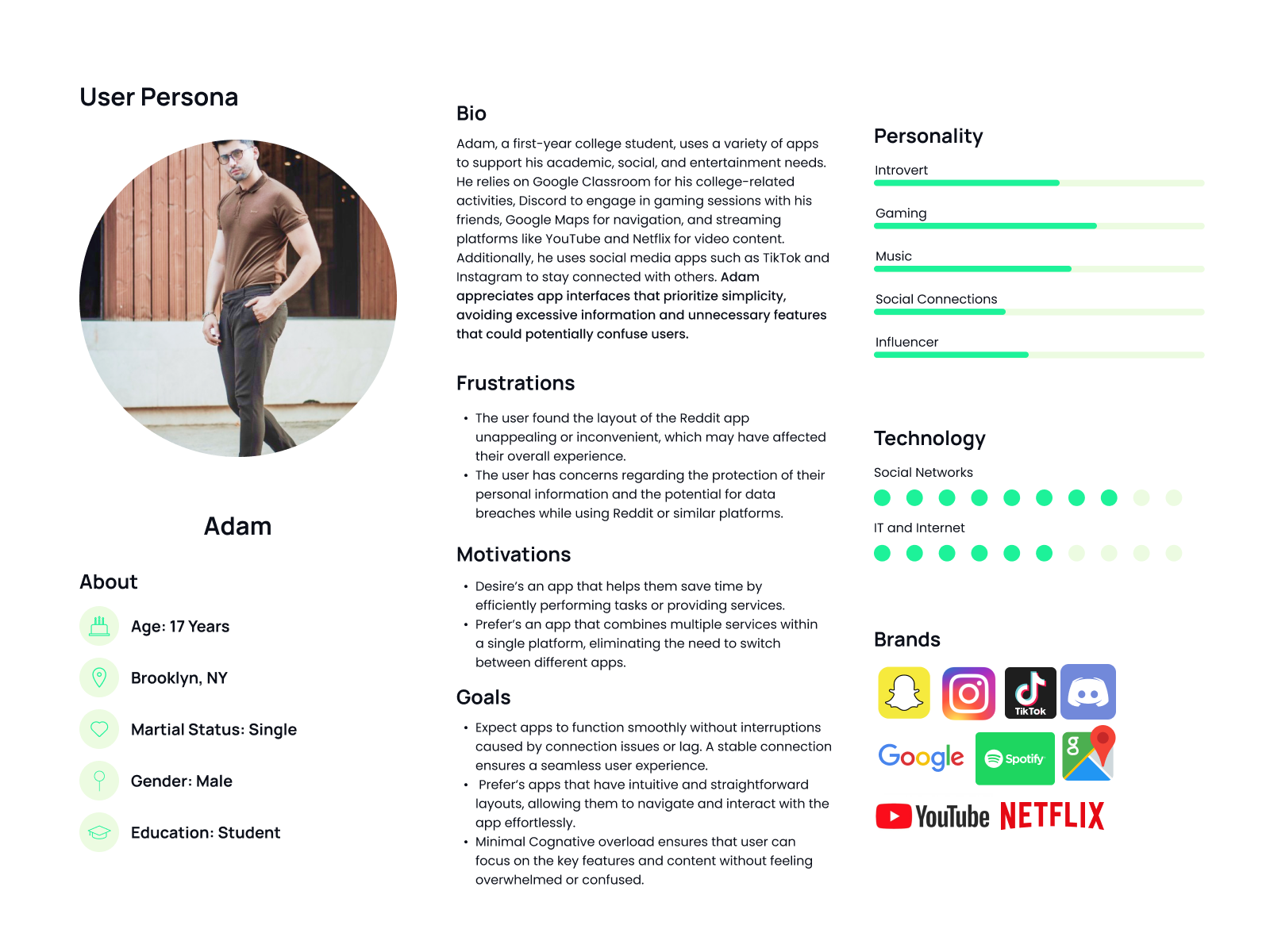
Defining the user’s personas
Through thorough research, two distinct personas are identified: Adam, a 17-year-old student who prefers straightforward and uncluttered app interfaces, and Emma, a 28-year-old who prioritizes app security and seeks a user-friendly layout that is intuitive and easy to navigate, aiming to avoid any potential confusion.

Ideation
StoryBoarding
Card Sorting
Information Architecture
Defining the Ideation Stage
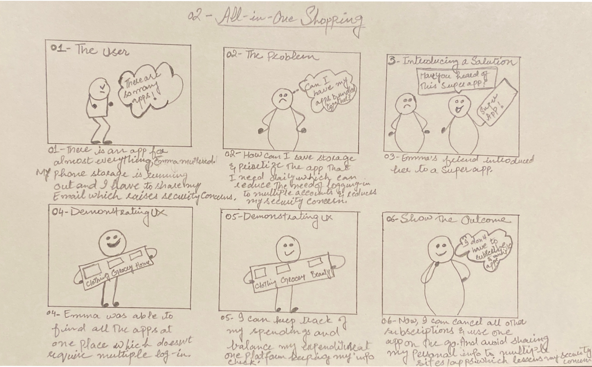
Using the user personas as precedence, I utilized storyboards to gain insights into the features that would be most valuable to the users, assisting in the creating an effective sitemap, user and task flows. These storyboards acted as a roadmap, outlining how users would engage with the platform and guiding the development process.
StoryBoard
After analyzing the findings from user interviews and surveys, it was evident that users are receptive to using an app that provides multiple services due to its time-saving and convenient nature. Based on these insights, the most preferred features were shopping and streaming content like movies, music, and shows, followed by social networking features. However, considering project length and time constraints, I have decided to focus on two features: shopping and entertainment.

Card Sorting Exercise
I conducted an unmoderated Hybrid card sorting using Optimal Workshop to gain insight into the user’s mental modal. The study involved 5 participants, with an average completion time of 7 minutes and 41 seconds per participant. Out of the participants, two were male and three were female. Based on the users' feedback, the following conclusions are found:
Most participants (80%) grouped movie categories with their respective movie reviews and ratings.
A significant portion (60%) of participants grouped the latest movies with the most watched movies under the entertainment category.
Most participants (80%) grouped produce and meat together under the groceries category.

The image provided visualizes the mental model using a similarity index, which is generated through the hybrid card sorting method.
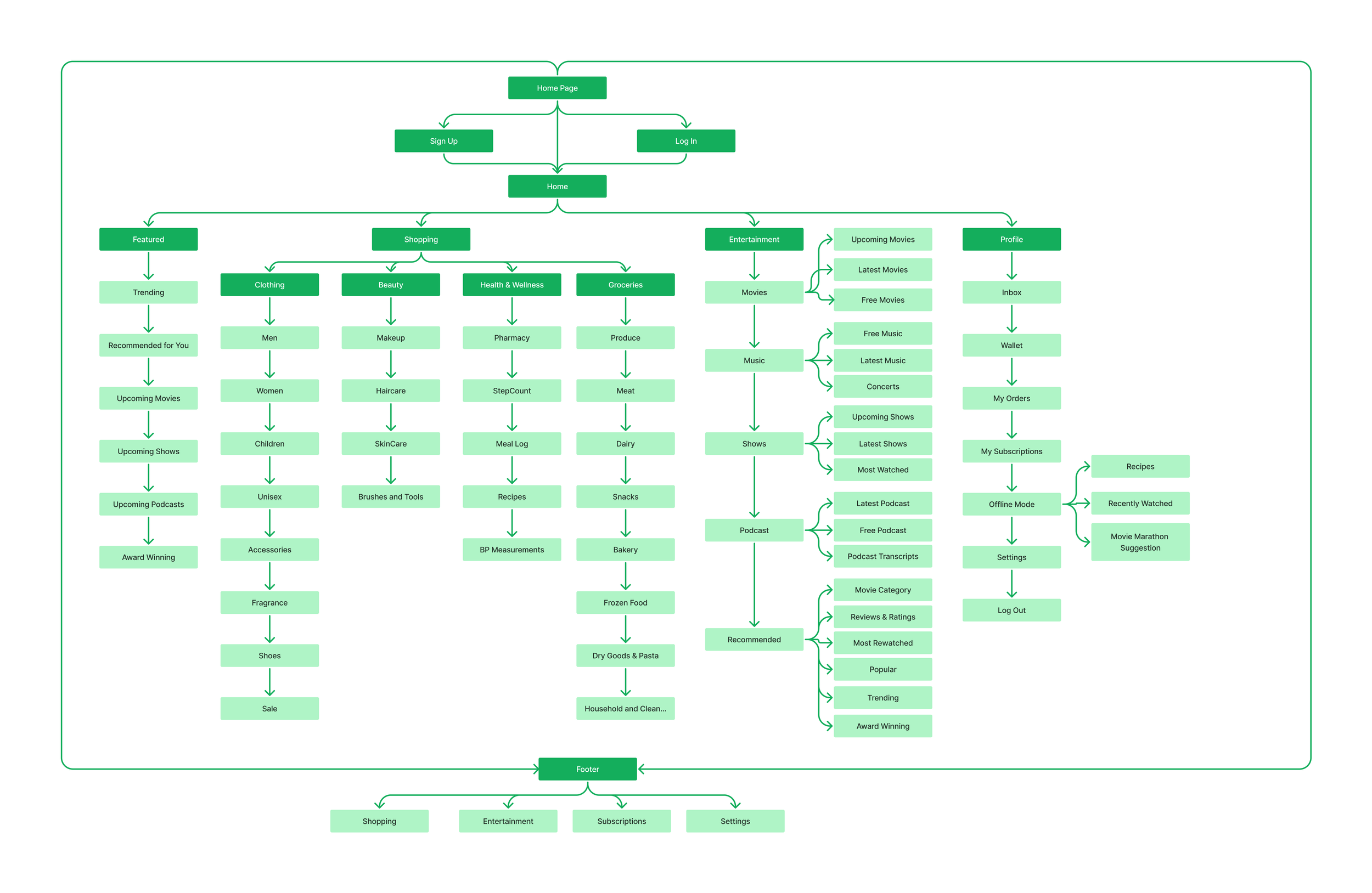
Information Architecture
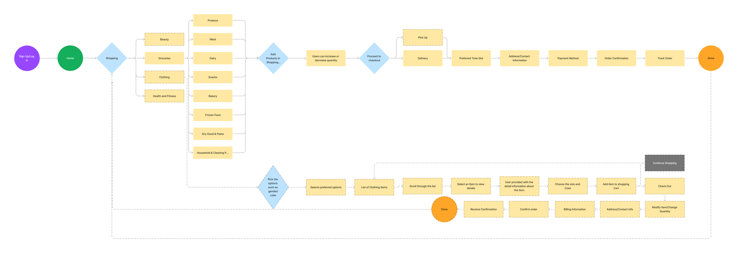
After completing my storyboard and analyzing the hybrid card sort data, I constructed the site map, aligning it with the users' mental model while making slight adjustments based on my observations. With the site map in place, I developed user and task flows to depict how users would navigate and complete tasks visually. This process provided valuable insights into the user journey, allowing me to identify any challenges or potential areas for improvement. Based on the insight, I successfully designed two user flows:
In the first flow, users can navigate to the shopping tab and place an order.
Furthermore, the second user flow enables users to stream their preferred content, including movies, shows, and more.


Interaction Design
Sketches
Low Fidelity Wireframes
Sketches
Once I completed the information architecture, I moved on to the interaction design phase, where I created sketches and low-fidelity wireframes. These initial sketches were essential for visualizing interface ideas and served as a starting point for refining the design, exploring layout options, and testing different functionalities.

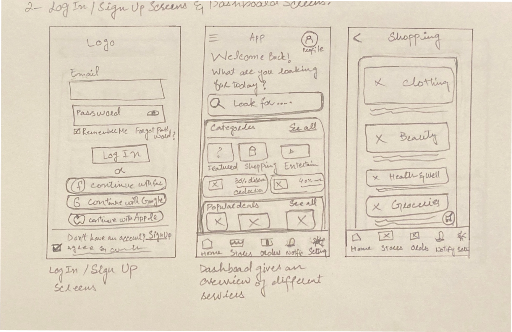


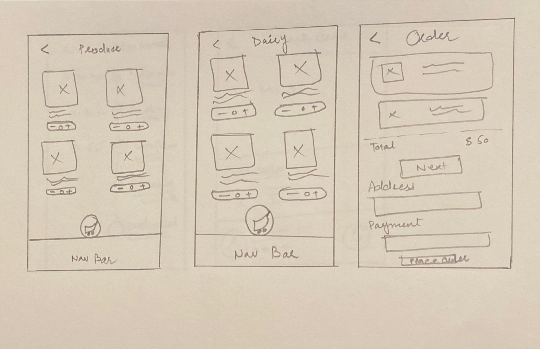


Low Fidelity Wireframes
After completing the initial sketches, I digitally transformed them from paper to a digital format, taking into account valuable feedback and making necessary adjustments. Through an iterative process, I refined the design and made enhancements to optimize the overall user experience.
Design & Branding
UI Kit
High Fidelity Wireframing
UI Kit
For my design, I have decided to embrace the color green and its various shades as the core of my primary color palette. I aim to achieve a visual equilibrium and a harmonious overall aesthetic by incorporating green. This color is known for its ability to evoke a soothing sensation, promoting relaxation and a sense of security. Moreover, green can calm the mind and dispel negative thoughts and emotions. Many successful companies opt for green in their logos to convey a tranquil and trustworthy sense of optimism. Additionally, the color green enhances creative performance, making it a valuable addition to any color scheme if you seek to foster innovation.
In contrast, I have chosen shades of orange, yellow, bright pink, and teal blue to represent the cards in my design. These colors are selected for their ability to evoke a feeling of freshness. Each shade adds a vibrant and refreshing touch to the overall composition, enhancing the visual appeal and capturing attention.
As for the typeface, I have opted for Lato. Lato is a versatile and widely acclaimed typeface with an impressive blend of readability and elegance. With its clean and modern aesthetic, Lato complements the overall design, ensuring clarity and legibility of the text while adding a touch of sophistication. Its versatility allows for seamless integration into various design elements, making it suitable for conveying information effectively and maintaining a cohesive visual identity.

High Fidelity Wireframes
Once I refined the mid-fidelity wireframes, my next step involved creating high-fidelity wireframes. These detailed wireframes incorporated all the necessary refinements and improvements. After finalizing the high-fidelity wireframes, I conducted usability testing to assess the user experience and gather valuable feedback. This testing allowed me to evaluate the effectiveness and intuitiveness of the design, making necessary adjustments based on the insights gained from user interactions.
Testing & Iterating
Prototype
Outcomes of Usability Testing
A/B Testing
Prototyping
Following refining my high-fidelity wireframes, I proceeded to the last phase of prototype development. Once the necessary refinements were integrated, I tested usability to gather valuable feedback. Using this feedback, I implemented specific adjustments to shape the final prototype. The subsequent section provides a concise summary of these modifications.
Outcomes of Usability Testing
Users find the layout of the application highly intuitive and free from complex elements, allowing for easy navigation. They have experienced seamless navigation without any difficulties. Additionally, users appreciate the concept of a unified platform that offers various services, providing convenience and a user-friendly experience. To further enhance the user experience, it is recommended to improve the clarity of the wording under navigation bar icons, ensuring that users can easily understand their functions. Making the prototype more mobile-friendly and responsive is essential to accommodate different devices and provide a consistent experience. Adding the "add a new address" feature would streamline the process for users who frequently need to input new addresses. Furthermore, considering the relocation or improved visibility of the chat box can facilitate better communication and accessibility for users. These enhancements contribute to an optimized UI/UX and a more satisfying user experience. Below are some findings from usability testing:


A/B Testing
Apart from usability testing, I also conducted A/B testing, and the results were quite surprising. During the A/B test, users were presented with two different card layouts. On the left, there were multiple pictures of each action, while on the right, there was a description along with an image of the task. Interestingly, 4 out of 5 participants preferred the cards on the right that contained both images and descriptions, rather than just images.
As a result of the A/B testing, I have decided to proceed with the cards that include images and descriptions for my final design.

Iterations Based on Usability Feedback
-

Before
The original version did not provide any options for users to add their address.
-

After
Based on the suggestions from the usability testing, an option to add a new address was incorporated.
-

Before
Users find the copy beneath a few navigation bar icons to be confusing.
-

After
After conducting the usability test, I made updates to the copy, resulting in a clearer and more intuitive version.
Learning and Takeaways
While brainstorming and searching for a problem to solve, I stumbled upon the concept of a Super app designed specifically for Asian users. This idea is intriguing because it has the potential to significantly simplify users' daily lives by offering a comprehensive range of services in one convenient platform. The presence of a super app would eliminate the need to navigate multiple sources and provide a hassle-free experience for users, which greatly appeals to me.
What went well?
The prototype received positive feedback from users, who found it engaging and easy to navigate various processes.
Constructive feedback was instrumental in enhancing the project and making it more user-friendly.
The project brought me great satisfaction, as it resulted in the creation of a valuable and enjoyable experience for the user.
This project provided me with valuable insights into the potential future of the app and the users' willingness to embrace a super app if such a product were available in the market.
What needs improvement?
Despite users finding the interface easy to navigate, their concerns about the app's security persist due to its incomplete nature. To foster confidence and address these concerns, it is essential to improve the app's security, enabling users to utilize it without any hesitation.
Users expressed concern regarding battery drainage and requested that the app be designed in a way that minimizes battery consumption once it is launched.
What’s Next?
Currently, the app must function smoothly, and regular bug fixes are necessary to ensure a seamless user experience.
Integrating a payment option into the app is a valuable asset. Users could make payments conveniently using QR codes, benefiting street vendors and small businesses. This feature would eliminate the need for carrying cash, providing a more seamless and secure payment experience.
Furthermore, in a globalized world, the inclusion of the payment option would enable us, as US citizens, to utilize it while traveling, eliminating the reliance on credit cards. As long as users have access to the same payment system, transactions can occur seamlessly regardless of location.