Matrimoni
Matrimoni is a responsive wedding planning site, is designed to simplify the wedding planning journey for couples. Utilizing our venue search feature, users can effortlessly narrow down their options based on preferences, eliminating the need for multiple in-person visits. Additionally, we provide comprehensive details on catering, clothing, cake, photography, and decorations, effectively reducing stress for newlyweds.
Role
UX/UI Designer
Team
Product Manager,
Front-End Developer, &
Back-End Developer
Tools
Figma, Figjam, Usability Hub,
Optimal Workshop,
Trello, Discord, &
Google Suite
What I did
User Interviews,
User Research,
Prototyping, Wire framing,
Usability Testing,
and Information Architecture
Timeline
Sep 2023 - Nov 2023
Background & Team Challenge
When our team first formed, the project idea was introduced by our initial Product Manager, who had a strong passion for wedding planning. While the scope was ambitious, it presented an exciting opportunity for creative exploration.
Two weeks into the project, the Product Manager had to step away from the cohort, which required the team to quickly reorganize and adapt. During this transition, I took the initiative to help realign the project, structure our next deliverables, and collaborate closely with the incoming Product Manager and developers to ensure continuity.
We also rebranded the project from “Kekkonmi” to “Matrimoni,” giving it a refreshed identity and a stronger sense of shared team ownership. This moment became an opportunity to strengthen collaboration, enhance communication, and demonstrate adaptability, which played a key role in the success of our final delivery.
The Problem
Many couples, especially those under 30 with a budget of $25,000 or less, encounter difficulties in efficiently tracking their wedding budget and organizing tasks.
A 2022 survey by The Knot found that 47% of couples struggled with budgeting, and 36% faced challenges with guest list management. The complexity of coordinating multiple tasks and expenses can lead to overspending and difficulties in prioritizing, making it challenging to plan and execute a successful wedding without effective tools or systems in place.
How might we make it easier for newly engaged couples to plan for their dream wedding while reducing the planning time, expenses, and stress?
Solution
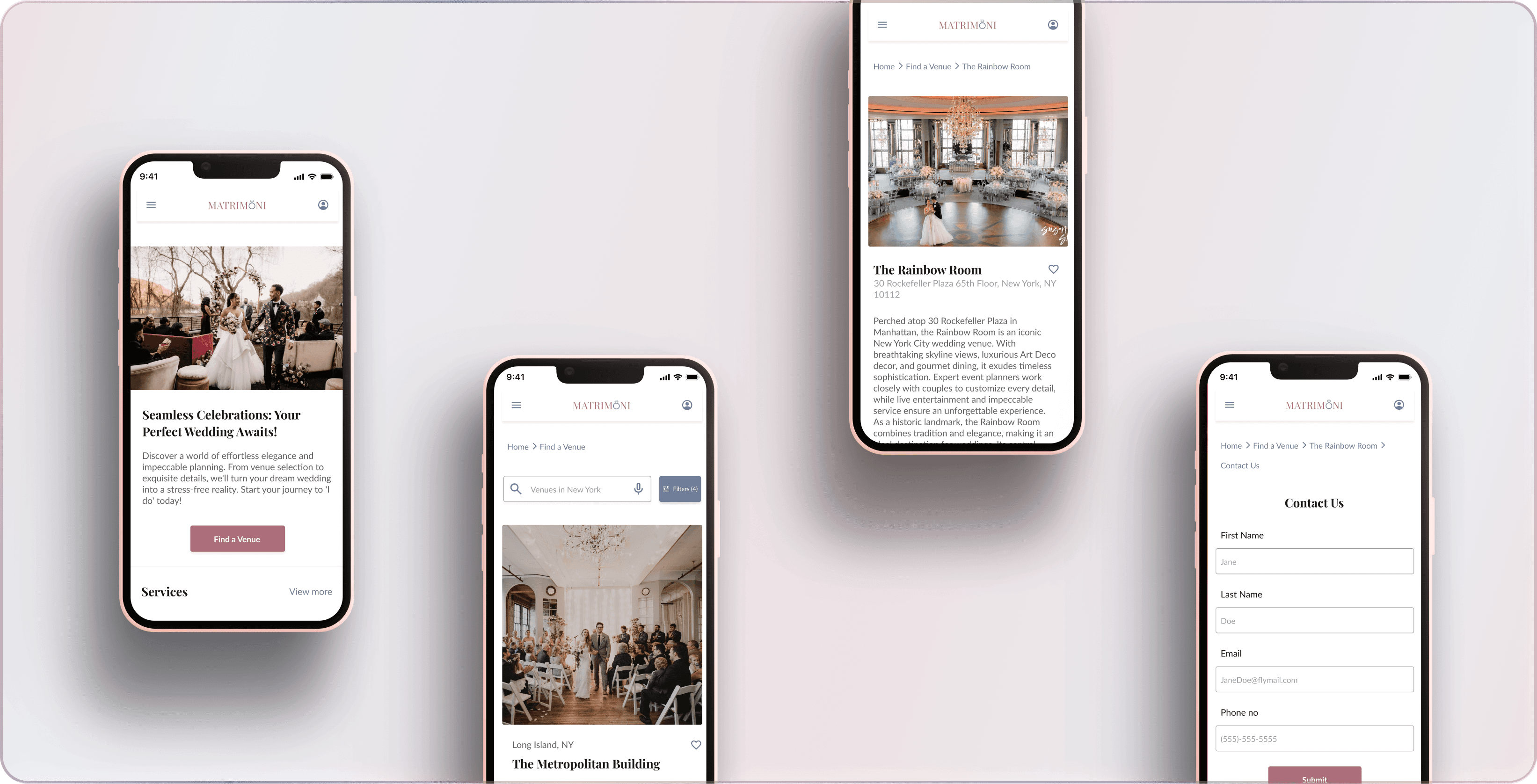
Based on our user research and feasibility discussions, our team decided to focus on developing the venue search feature as the core functionality for the MVP.
This feature enables users to explore and filter venues based on their preferences such as location, price, and capacity without the need to create an account. Users can choose to log in if they wish to save their favorite venues or revisit their searches later.
By prioritizing this feature, we aimed to provide couples with a simple and stress-free way to discover suitable venues, addressing one of the most common challenges identified during our research.
User Research
The initial research was led by our first Product Manager through surveys and interviews, which I later helped synthesize into actionable design insights after he left the project. This continuity ensured that we carried forward the team’s original data while aligning it with already established design priorities.
Research Goals
Before diving into design, we needed to understand what makes wedding planning so stressful for couples. Our goal was to develop a single, streamlined solution that simplifies the process especially for couples under 30 planning weddings on a budget of $25,000 or less.
Helps couples manage their budget without losing their vision.
Makes finding and booking venues simple and enjoyable.
Enables smooth communication between couples, vendors, and families.
Reduces the time, stress, and cost that usually come with wedding planning.
Research Insights
To understand the challenges of wedding planning, we combined primary user research (surveys + interviews) with secondary insights from design studies and industry articles. This helped us capture both user frustrations and broader cultural and usability patterns.
Primary Research- User Interviews & Survey
Through surveys and interviews with 21 participants aged 25–40, we uncovered clear patterns around how couples plan their weddings and where they struggle the most.
Venue search is the biggest stress point.
72% of participants said finding a suitable venue was the most difficult part of their planning journey. Many felt overwhelmed by scattered information and a lack of reliable filtering options.Budget management relies on manual tools.
65% used Excel sheets to track expenses, highlighting a gap for integrated and easy-to-use digital solutions.Planning takes longer than expected.
55% of participants spent over six months planning, often because of the time spent coordinating between vendors, families, and logistics.Existing tools lack inspiration and personalization.
62% found current wedding planning apps functional but uninspiring, with limited customization and rigid workflows.
Secondary Research
Rushali Attal’s UX Research: Showed the need for an intuitive, unified system to close communication gaps.
Haley Sprankle’s Article: Highlighted tools like Airtable and Trello for better task management and collaboration.
Selena Hoy’s Study: Emphasized the importance of balancing modern functionality with cultural and emotional significance.
Takeaway: Both user data and literature confirmed a clear gap. Couples need an organized, emotionally engaging, and culturally aware platform that simplifies wedding planning end to end.
Competitive Analysis
Building on our user research insights, we explored existing wedding planning tools to understand how well they address users’ needs and where gaps remain. Our analysis focused on usability, affordability, visual appeal, and the emotional experience they deliver to users.
I compared three major platforms: The Knot, The Big Day, and Planning Pod to identify opportunities for differentiation.
The Knot stands out for its inspirational and visually engaging interface, but its pricing tiers can be restrictive for budget-conscious users.
The Big Day offers a clean and intuitive experience at an affordable rate, though its limited content depth reduces long-term engagement.
Planning Pod provides powerful functionality for managing logistics, yet its interface feels dated and lacks emotional appeal.
Opportunity: There’s a clear gap for a platform that combines the visual inspiration of The Knot, the simplicity of The Big Day, and the practical tools of Planning Pod all in one cohesive, budget-friendly solution.
Platforms
Strength
Weaknessess
Opportunities for
our product

The Knot

The Big Day

The Planning Pod
Comprehensive planning tools with a focus on inspiration and content.
User-friendly interface with visual appeal.
Flexible pricing options (free and premium plans).
Affordable lifetime subscription with a free trial.
Well-designed, intuitive user interface.
Prioritizes functionality over aesthetics, catering to users who need robust planning tools.
Subscription-based pricing with multiple tiers.
Free version has limitations.
Premium pricing may be too high for budget-conscious couples.
Limited inspirational content compared to The Knot.
May lack advanced features for professional users.
Limited international presence, primarily in Japan.
Faces competition within the Japanese market.
Offer enhanced budget tracking and task management features.
Focus on an intuitive and accessible mobile experience.
Provide comprehensive inspirational content while maintaining affordability.
Add advanced planning features to appeal to a broader audience.
Enhance user interface and mobile app for a more appealing experience.
Expand reach beyond Japan with content that resonates with international users.
User Pain Points
After speaking with users and gathering insights from our research, we identified the following pain point:
Scattered tools for tracking and communication.
Lost searches caused by mandatory logins.
Limited personalization or filtering options for venues.
User Persona
Based on our research, Krystal represents our core audience; young, budget-conscious couples planning their first wedding without professional help. Her needs guided every key design decision.
“I want my wedding to feel special and organized — without spending hours searching for the right venue.”
Design Focus: Krystal’s challenges inspired our focus on a seamless venue search, built-in budgeting, and saved searches without log-ins, creating a more efficient and enjoyable planning experience.
User Persona

Krystal
About
Age: 27 Years
California, USA
Martial Status: Single
Gender: Female
Education: MBA
Bio
Krystal, a 27-year-old bride-to-be, is preparing for her first wedding and her top priority is finding a beautiful dress to make her special day even more memorable. She believes the wedding will be a success if the guests are happy and they can enjoy a meal with their family members. With a budget of $25,000, she is seeking services or a platform that prioritizes client satisfaction.
Frustrations
Difficulty locating the best and readily available dress vendors for the wedding.
Challenges in finding suitable venues and vendors.
Struggles with managing budget and task priorities effectively.
The need to rely on vendors and their checklists, which can be frustrating.
Motivations
Desires a planner or platform that genuinely cares about clients and their preferences during the wedding planning process.
Wants more visual content and presence on the platform to aid decision-making and provide a clearer picture of available options.
Goals
Users want to efficiently and effectively find suitable venues and vendors for their wedding to ensure everything aligns with their vision.
Users aim to successfully manage their wedding budget and prioritize tasks to ensure a smooth planning process.
Users wish to have more control and flexibility in planning, reducing their reliance on vendor-provided checklists.
Users seek a personalized and client-centric wedding planning experience that aligns with their preferences and desires.
Personality
Fashion
GGIGOGOGOGGOBHIHIHIHIHIHIHIHIHIHIIHIHZSDCFGVHBJNGUGdcfghgvjhbkjnlknbxrxgrxrfxrfcxtyxytdytdytfydytdxxUG
Health & Fitness
bbbbhbhbhbxdfghvhcftxfxdxrdrdfrfdbbbbhbhbhbxdfghvhcftxfxdxrdrdfrfdbbbbhbhbhbxdfghvhcftxfxdxrdrdfrfdbbbbhbhbhbxdfghvhcftxfxdxrdrdfrfd
Family Oriented
nbbubbubbbbbhbhbhbxdfghvhcftxfhvhcftxfxfxdxrdrdfrfdbbbbhbhbhbxdfghvhcftxfxdxrdrdfrfdbbbbhbhbhbxdfghvhcftxfxdxrdrdfrfd
Social Connections
nbbubbubbbbbhbhbhbxdfghvhcftxfxdxrdrdfrfdbbbbhbhbhbxddfghvhcftxfxfxdxrdrdfrfd
Extrovert
nbbubbubbbbbhbhbhbxdfghvhcftxfxdxrdrdfrfdbbbbxdxrdrdfrfdbbbbhbhbhbxdfghvhcftxfxfxdxrdrdfrfd
Technology
Social Networks
IT and Internet
Brands


Problem Statement
Through research synthesis and pattern analysis, we revisited and sharpened our problem statement to align with user pain points and design opportunities.
How might we make it easier for newly engaged couples to plan for their dream wedding while reducing the planning time, expenses, and stress?
Brainstorming & Ideating:
From Insights to MVP: Defining Core Features
Grounded in our user research and Krystal’s goals, we began translating insights into structure and functionality. Our information architecture and site map were designed to prioritize ease of navigation ensuring that users could quickly find venues, manage their budgets, and save progress without friction.
MVP Planning and Pivot
Our initial plan included two main features:
1- Venue Finder – to help users discover and filter wedding venues easily.
2- Budgeting Tool – to allow couples to calculate and manage their wedding expenses seamlessly.
However, due to time constraints and technical feasibility, we decided to pivot and focus on delivering the Venue Finder as our core MVP feature. This strategic decision allowed the team to fully refine one high-impact feature instead of spreading efforts thin.
Venue Finder: Key Functionality
Our research revealed that 72% of users struggled to find suitable venues and often lost their progress due to forced logins.
To address this, we designed a venue search feature that allows users to:
Explore venues without mandatory logins.
Save searches after optional sign-up.
Filter and sort by location, price, capacity, and style.
Support for personalized recommendations in future iterations.
User Story: “As a user, I want to search for venues without logging in and save my searches later, so I can explore freely without losing my progress.”
This decision balanced user needs with project feasibility ensuring that we still delivered a polished, functional, and research-backed MVP within the cohort timeline.


Design, Test, & Iteration:
After finalizing the information architecture, I transitioned into the interaction design phase. I began with quick sketches and low-fidelity wireframes to visualize ideas and test early concepts. These initial explorations helped define layout possibilities and user flows before moving into higher fidelity.
Once the structure felt solid, I refined the wireframes digitally, incorporating feedback from the team and early usability insights. Iterative testing helped streamline navigation and enhance overall usability.
For the visual design, my goal was to strike a balance between elegance and simplicity. A design that felt modern yet emotionally resonant for couples planning their weddings.
Typography: Playfair Display for timeless sophistication, paired with Lato for modern readability.
Color Palette: A blend of dirty pink and soft blue to evoke warmth, romance, and trust — emotions central to the wedding experience.
The final high-fidelity wireframes reflected this harmony between usability and emotion, resulting in an experience that feels intuitive, refined, and heartfelt.


High Fidelity & Prototype
After refining the high-fidelity wireframes with attention to layout, visual hierarchy, and interaction details, I transitioned into building the interactive prototype. This stage brought the product to life. Allowing us to test real user flows, validate navigation patterns, and evaluate the overall look and feel in a realistic context. The prototype served as a bridge between design intent and user experience, helping us identify final usability improvements before handoff.
Usability Testing
To ensure our design truly addressed user needs, the new Product Manager conducted five moderated usability tests with participants aged 25–35, most of whom were recently engaged or had planned weddings in the past year. The goal was to evaluate how intuitive, visually appealing, and practical the platform felt for real users navigating the wedding planning journey.
Matrimoni Target & Results
User Engagement
Users found the navigation more intuitive and
straightforward, resulting in increased confidence
when performing actions within the design.
Target
60%
Results
80%
Layout
Users found the design user-friendly, highlighting its simplicity, appealing layout, well-chosen color palette, and clear text.
Target
40%
Results
60%
Content Clarity
Users praised the design for its clear layout
and abundance of valuable, well-organized
content.
Target
40%
Results
60%
Impact
Overall, usability testing validated that Matrimoni’s design is intuitive and approachable, offering a strong foundation for stress-free wedding planning. The feedback guided our next iteration enhancing color balance, refining navigation cues, and optimizing layout flow.
Iterations
After completing usability testing, we moved into an iteration phase to refine the interface based on user feedback. While the overall response was positive, participants highlighted areas that could be improved for greater clarity and engagement.
Users appreciated the design’s simplicity, clear layout, and inviting color palette, but noted some confusion on the landing page and venue search flow.
To address this, we updated the copy and layout on the landing page to improve clarity, visual hierarchy, and readability. The refined version communicates the product’s purpose more effectively, helping users navigate with confidence from the first interaction.


Before
Users find the copy to be unclear and ineffective.


After
Redefined the copy for clarity and better understanding.
Project Handoff & Future Potential
As we reached the later stages of the project, our team went through a product management transition. During this shift, I helped maintain continuity in design direction while adapting to new workflows and priorities. Despite the change, we successfully delivered a functional MVP centered on the core feature of Matrimoni: a streamlined venue discovery experience with intuitive filtering and navigation.
Although the budgeting feature was postponed due to timeline constraints, the structure and design groundwork have already been established, leaving clear potential for future development. The project now stands at a strong foundation, ready to be expanded into a more comprehensive planning platform when the opportunity arises.
Learning & Key Takeaways:
This project was a meaningful lesson in adaptability, collaboration, and design ownership. When our original product manager stepped away early in the process, I helped stabilize the project direction while continuing to lead the design development. Working closely with the new PM and developers taught me how to balance user needs with technical feasibility and timelines.
Despite the initial uncertainty, our team delivered a focused and functional MVP that met our objectives. This experience strengthened my confidence in navigating team dynamics, communicating clearly, and designing with practicality and intention. I look forward to applying these learnings to future projects and collaborative environments.