Fitness App MVP (Building a Habit-Forming Fitness Experience)
When we started FitnessApp, our goal was clear to build the most effective and most-used mobile solution for developing strength-training consistency and not just another workout tracker.
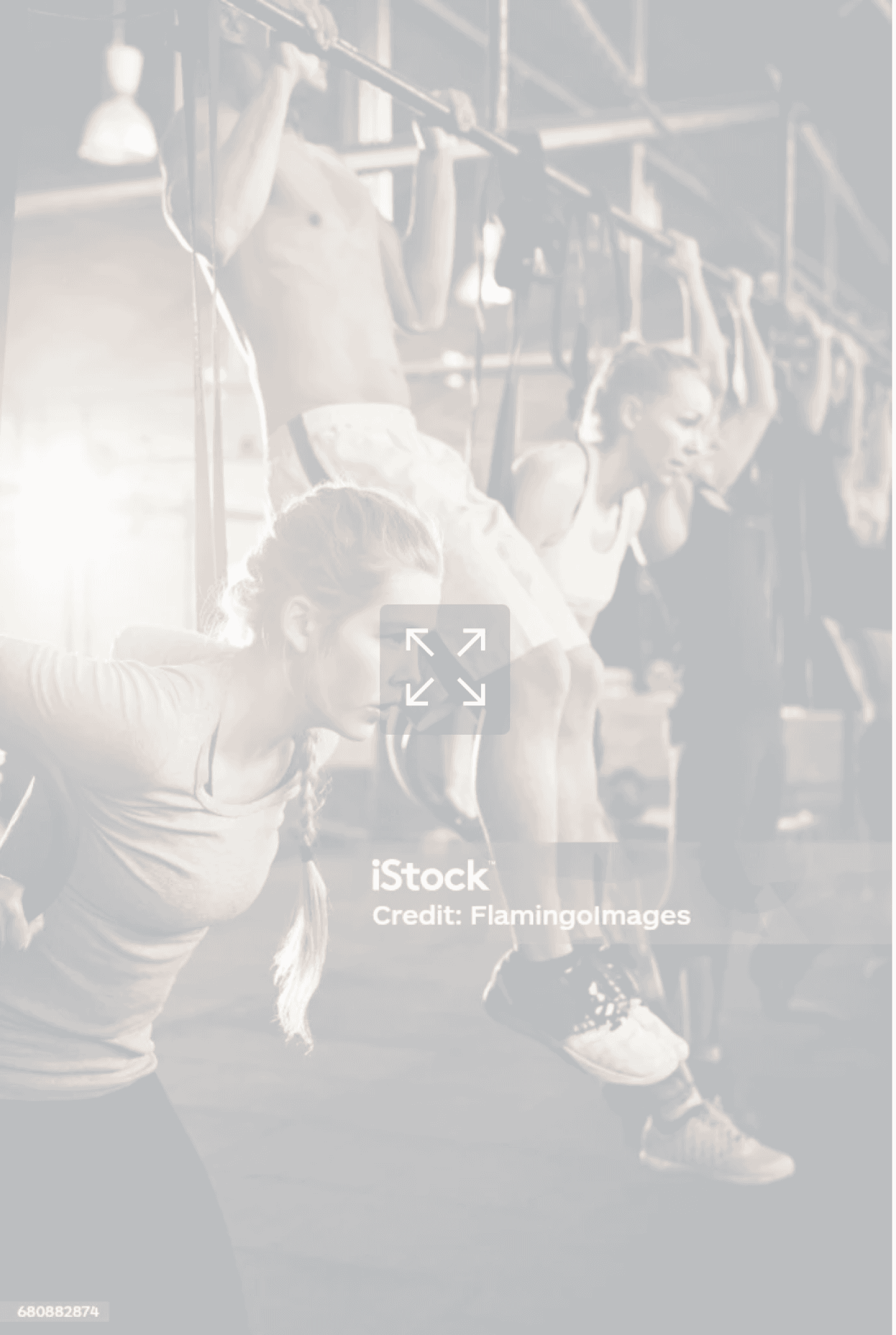
We wanted to help people across Europe who struggle to maintain long-term motivation, turning fitness into a sustainable habit that fits into their daily life.
But the challenge was real and most fitness apps felt cluttered, intimidating, or short-lived. Our goal was to design something that felt simple, visual, and encouraging, something users would actually stick with.


Role
UX/UI Designer
Team
Product Manager,
Front-End Developer,
Back-End Developer &
UX Designers
Tools
Figma, Figjam, Discord,
Basecamp, &
Google Suite
What I did
UX & UI Designs &
Build MVP
Timeline
July 2024 - Present
My Role in the Team
I joined the project as a UI/UX Designer, collaborating closely with our Product Manager, developers, and fellow designers.
I was responsible for shaping the core user flows, from wireframes to high-fidelity design and everything from defining visual hierarchy to building prototypes, updating the design system, and ensuring a clean developer handoff.

Because we worked remotely, communication had to be intentional. Our PM supported the process with Loom walkthroughs, and each iteration cycle became a chance to refine both our design and our teamwork.
Designing with a Purpose
Before starting, we studied popular apps like Heavy and Fitbod. They offered powerful features but often felt dense and visually overwhelming.
That’s when we defined our design principles:
Clarity first: Condense complex information into scannable, visual layouts.
Consistency matters: Align typography, spacing, and component behavior across flows.
Motivation through simplicity: Make every interaction feel achievable and rewarding.
Familiar, not boring: Take inspiration from industry standards (like Heavy App) but with a cleaner, calmer visual language.
These principles became our compass throughout the MVP design.
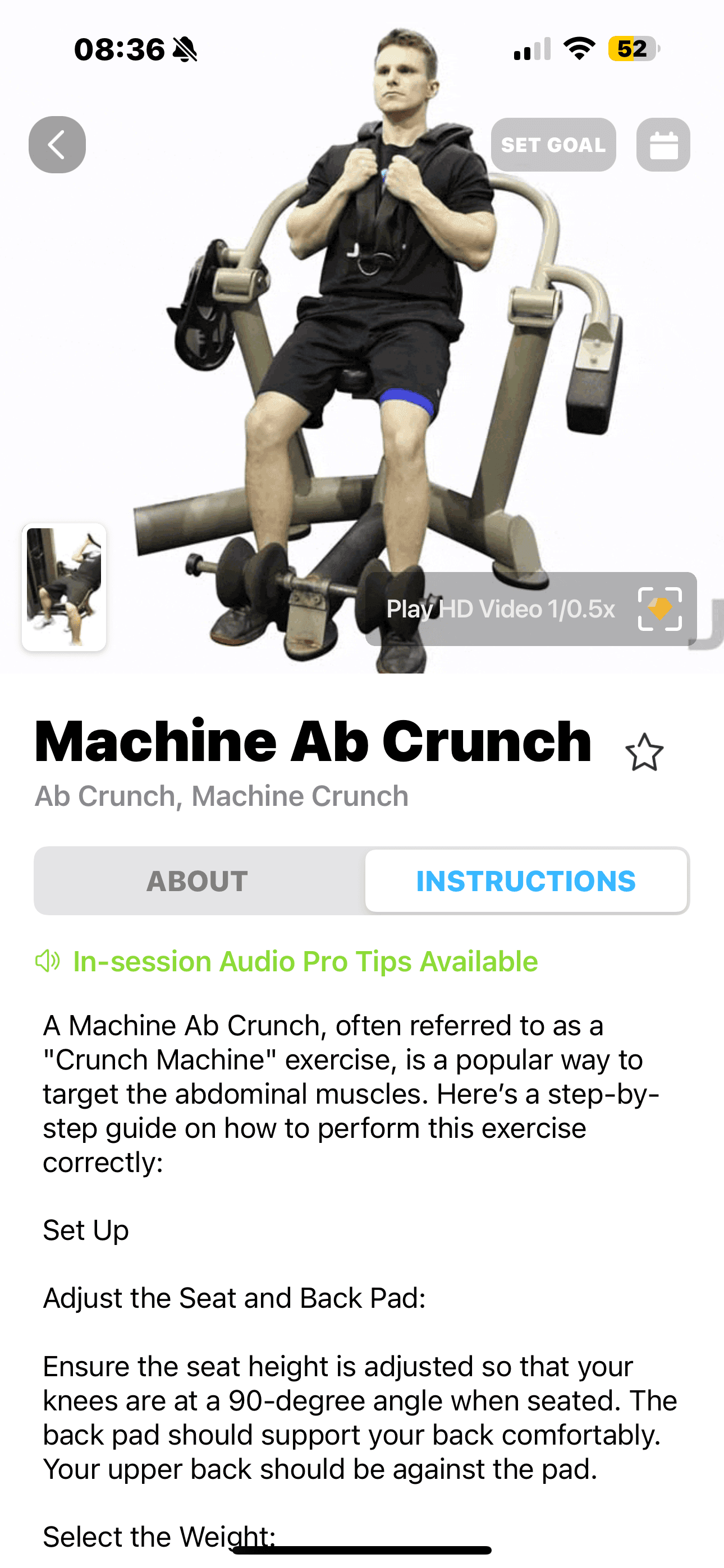
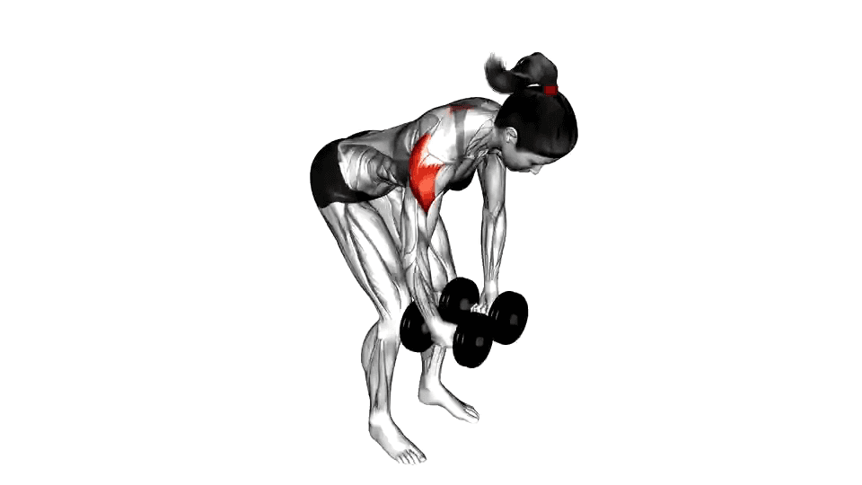
Reverse Fly
Rear Delt Fly, Bent-over Lateral Raises
About
Instructions

Step-by-Step Instructions
Listen
Stand with feet shoulder-width apart, holding dumbbells, and hinge forward at the hips.
Let the dumbbells hang, palms facing each other, with a slight bend in your elbows.
Raise arms to the sides, squeezing your shoulder blades together.
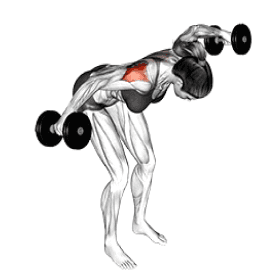
Stop when your arms align with your shoulders, forming a "T."
Slowly return to the starting position.
Complete your desired reps, keeping good form.
Add exercise
Heavy on the left, Trainly on the right
Other Apps
Trainly
Key Flows I Designed
Program Details
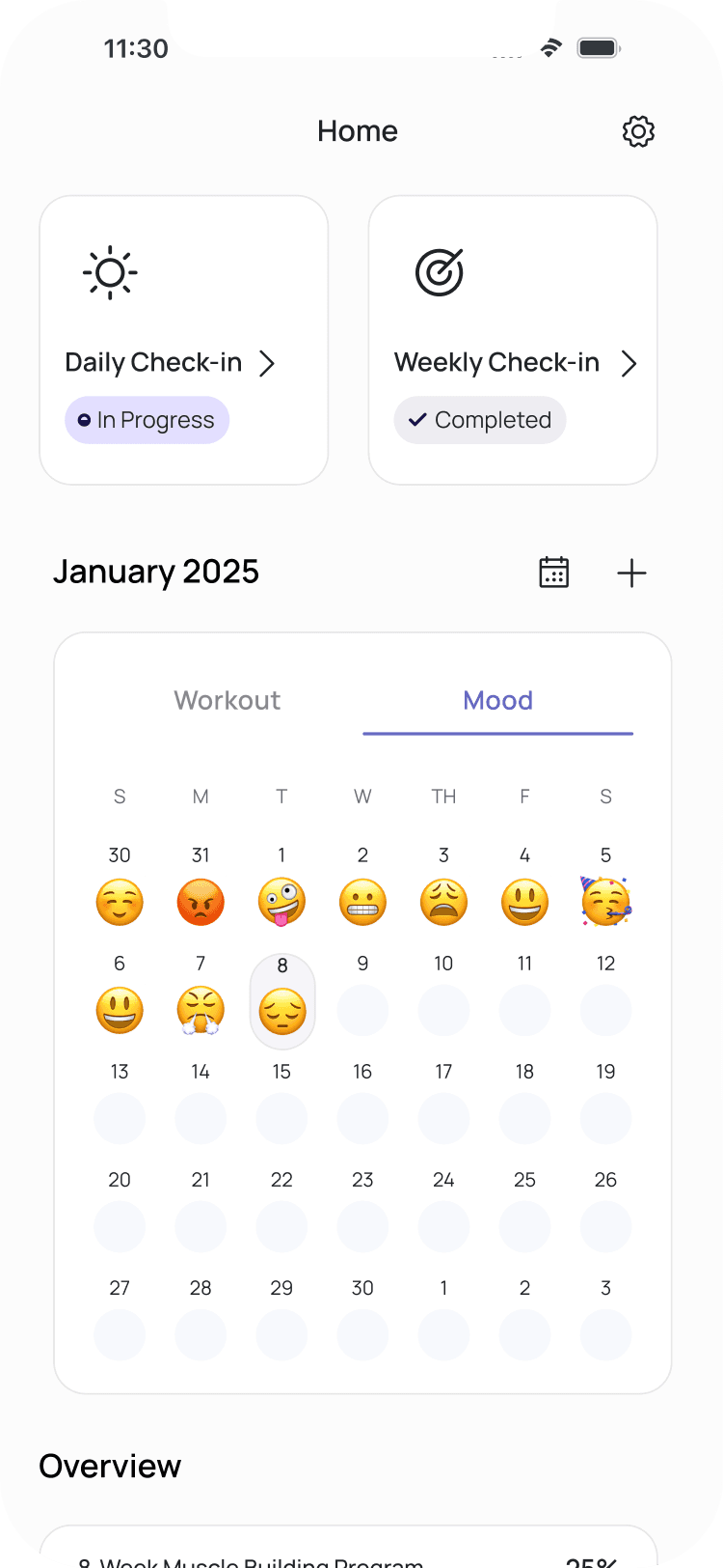
This was one of the most crucial flows, a new concept that didn’t exist in our earlier app versions.
The idea was when users land here, they should instantly understand their fitness plan such as workouts, supplements, BMI, and progress all at a glance.
The biggest challenge was information density. I focused on creating a visual rhythm that lets users scan and move, not pause and think. Every data point was redesigned to fit in a single, cohesive layout.
After beta feedback, I added tooltips and disclaimers to help users interpret their stats safely and clearly.
Workout View
Once users understand their program, they need to dive into action. The Workout View bridges that gap.
It allows users to see daily workouts, sets, reps, and weights. All structured in a way that feels light and motivating.
Here, I focused on hierarchy and usability, ensuring that key workout data appears in logical order, with minimal scrolling. Every component was crafted for clarity and repeat use.
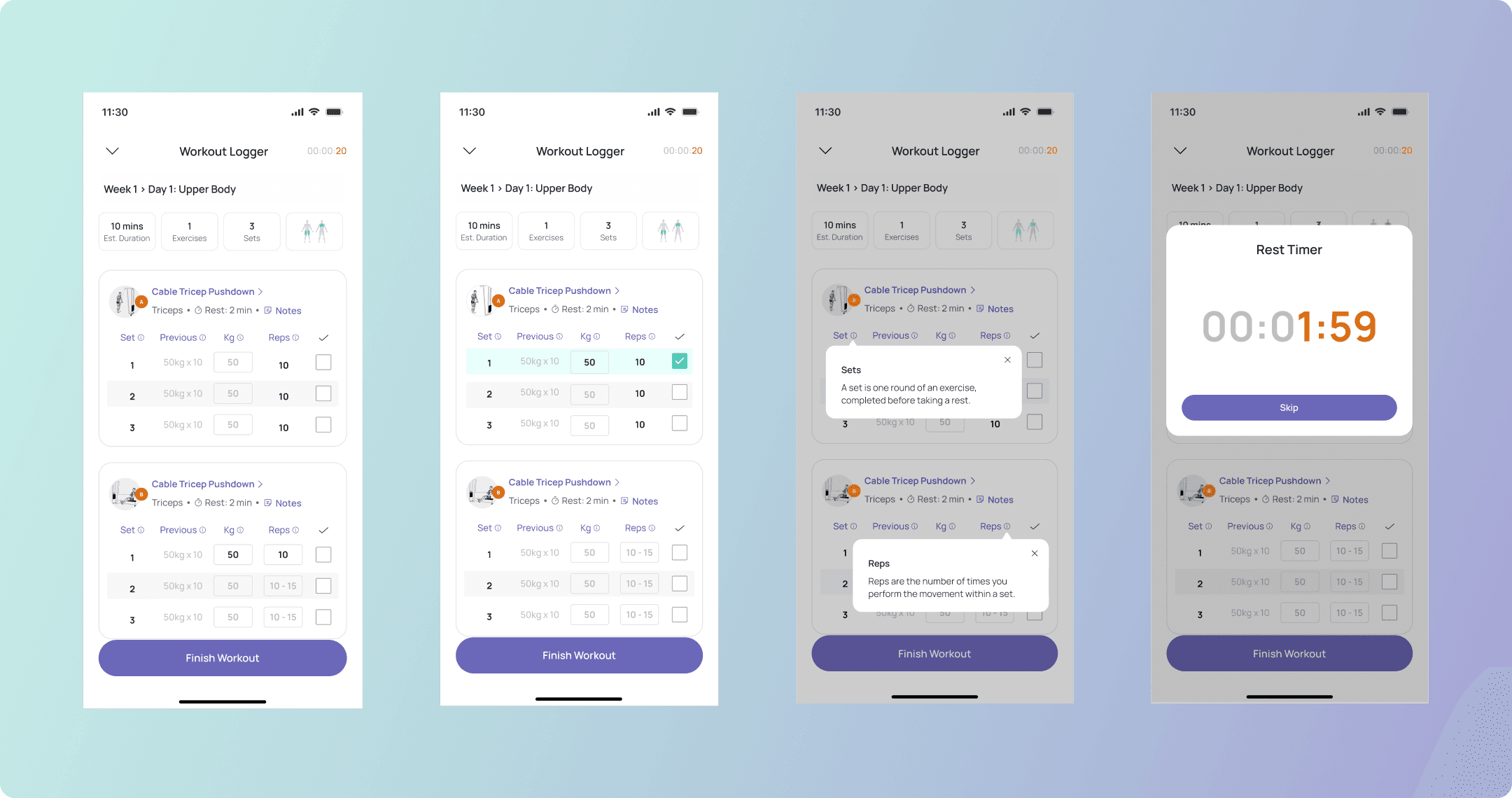
Workout Logger
Logging a workout can easily feel like a chore. Our goal was to make it effortless, fast, and motivating.
This was by far the most complex flow. Users needed to:
Log sets and reps
Adjust weights
Track rest time — all within one interaction
I designed the layout to minimize friction: large buttons, clear states, and intuitive feedback. The timer, weights, and logging interface live in a single space so users never break focus during a session.
We went through 8–9 design iterations, refining every microinteraction until the experience felt seamless.
MVP Strategy, Iteration, and Impact
To create a focused and effective MVP, our PM and I centered the product on one clear goal: helping users progress through their strength-training journey with confidence and simplicity. I translated complex user stories into structured and intuitive flows, covering program details, workout execution, and progress tracking, while reshaping dense requirements into interfaces that felt light, scannable, and habit-forming.
Each flow went through multiple rounds of refinement, guided by asynchronous collaboration, team feedback, and beta-testing insights. These iterations allowed us to make meaningful improvements without adding complexity, ensuring the experience remained approachable and motivating.
This process reinforced an important lesson I carry forward: as I often reflect, “Design is never really done.” Iteration is constant, and even after launch, there is always room to refine and evolve.
The final MVP delivers a cohesive experience that supports long-term consistency and reflects a design philosophy centered on clarity, empathy, and helping users make sustainable progress.